I mind mapped some ideas to try and get an idea of where I could take it.

Before we had been giving the studio brief I had been working on branding myself. Below is some of the ideas i had. My first idea was to use my second name 'Everitt' as 'ever it'. The type surrounding the text 'What Everitt Takes' was everything I'd do to get the job done.


I also tried using my handwriting as I thought this was very personal:


So after mind mapping ideas of how I wanted to brand myself, I sketched out some logo ideas. I liked the idea of having a crest, as I felt it reflects quality, professionalism and reliability. I also liked the idea of having a 3D logo.

I took some of the ideas I liked and digitalised them to try and get a better feel for them, and to see if they worked well on screen. Below is the development of the logo as I refined it:


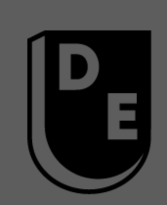


Below is the final logo that I decided on. Once I had the logo done I chose five six colours that I really liked, and what I thought worked really well together.
With the logo I wanted to show construction, pushing forward and developing my practice.
The colours I chose were down to personal preference. The red and the yellow represent productivity, warmth and are quite friendly. The cooler colours including the green, teal and grey show more of a professional more formal side to my work. I also have given a primary logo and an alternative so that it can be used across all media.

Here is my identity mocked up onto appropriate stationary:

No comments:
Post a Comment