I took some screenshots of the development:
I designed some initial ideas of how I wanted it to look on the computer, before figuring out then where I could take it etc.

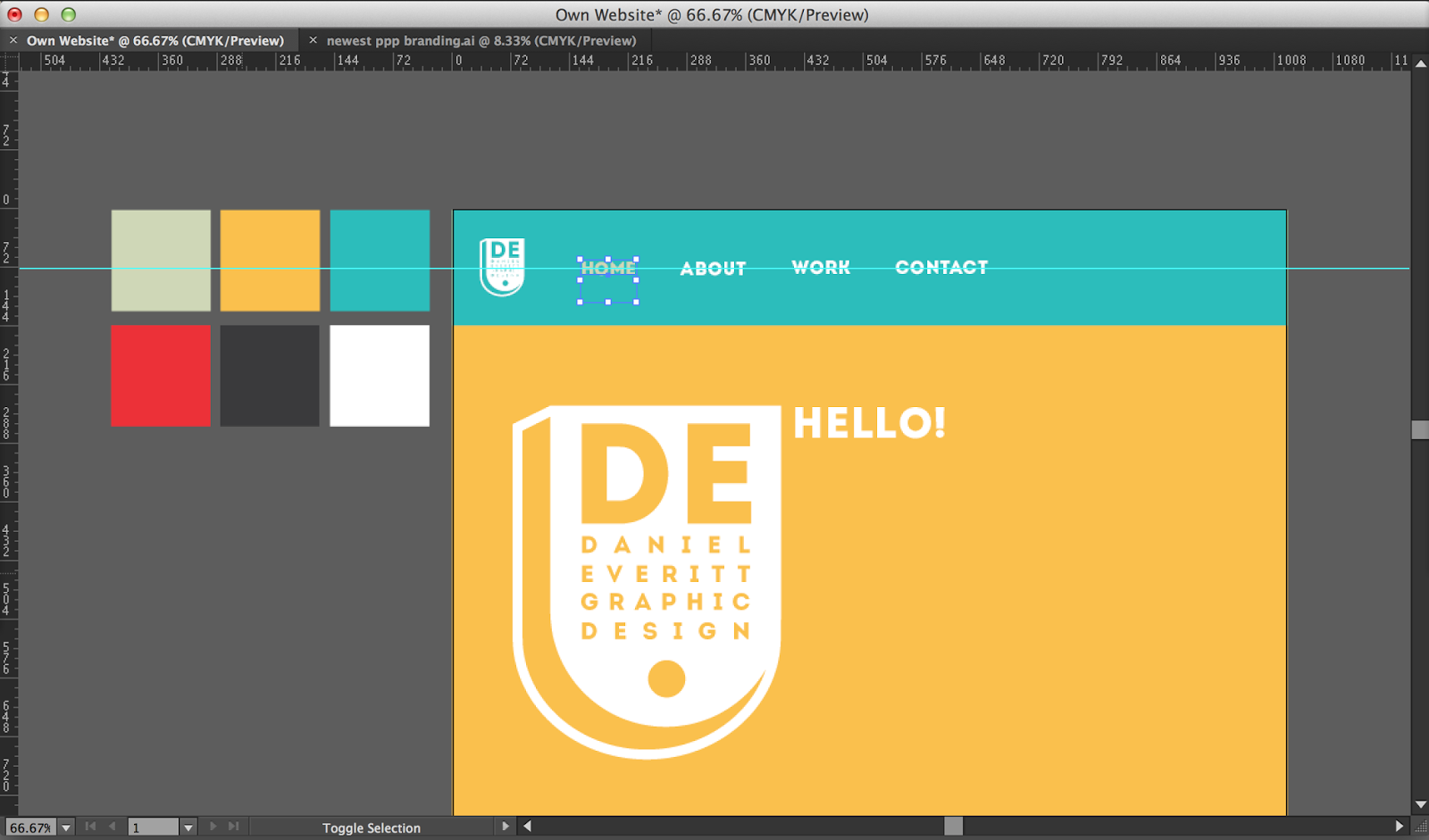


So up to this point I had got an initial layout, and had sorted out what colours I wanted to use etc. I then refined this design and added my content. I wanted it really colourful, really simple, and to the point.


Here is my final website mock ups.

My welcome page introduces who I am and what I do. The navigation bar is easy to use, from the welcome page you can go to 'about, 'work' or 'contact'.

The 'about' page shows an image of me, gives you details of who I am and the skills I am best at. The about page is to make sure the reader knows all about me and my creative practice etc. It's neatly laid out on a grid so it's easy to read and fits to any size mac screen without odd scaling.

The work page gives examples of my work, laid out in a four way grid its easy to navigate around. Clicking an image will enlarge it and give you information and bigger pictures of the work. Again not a lot of text, it's more image based.

This is an example of the page when you click on an image of my work. As you can see the image is enlarged and there is text about the project.

No comments:
Post a Comment